

CSS- Sheryians

A passionate MERN Stack Developer from India
I am a full stack web developer with experience in building responsive websites and applications using JavaScript frameworks like ReactJS, NodeJs, Express etc.,
1. CSS Reference Guide- Study Material :
CSS Boiler Plate
 /* Css boiler plate */
*{
    margin: 0;
    padding: 0;
    box-sizing: border-box;
}
html, body{
    width: 100%;
    /* height: 100%; */
    min-height: 100vh;
}
CSS Boiler Plate - emmet abbreviation in VS Code
📃 Paste this code inside: Setting -> User Snippets -> css.json
Sheryians VS_Code_Shortcuts - Reference Link
{
    // Place your snippets for css here. Each snippet is defined under a snippet name and has a prefix, body and
    // description. The prefix is what is used to trigger the snippet and the body will be expanded and inserted. Possible variables are:
    // $1, $2 for tab stops, $0 for the final cursor position, and ${1:label}, ${2:another} for placeholders. Placeholders with the
    // same ids are connected.
    // Example:
    "Print to console": {
        "prefix": "cssboiler",
        "body": [
            "*{"
                "margin: 0%;"
                "padding: 0%;"
                "box-sizing: border-box;"
            "}"
            "html,body{"
                "height: 100%;"
                "width: 100%;"
            "}"
        ],
        "description": "Log output to console"
    }
}
Imp Points
inline ke case mein height & width work nhi karega
absolute ke andar absolute hai - when it has supreme parent as relative
then parent absolute will acts as relative by default.
for nav bar to make it right use text-align: right;
Pic/Color Behind the TEXT
h1{
    background: linear-gradient(orange, gray, green);
    background: url("deities-iskcon_bpl.jpg");
    background-position: center;
    background-size: cover;

    background-clip: text;  // ⭐⭐
    color: transparent;    // ⭐⭐
}
GlassMorphism Effect
#box{
    background-color: rgba(255, 255, 255, 0.2); // opacity < 0.5
    backdrop-filter: blur(10px);
}
Method 2

🔠Custom Font Declaration - 🅰️
@font-face {
    font-family: larken;
    src: url('./LarkenDEMO-Regular.otf');
}
@font-face{
    font-family: edo;
    src: url('./edo.ttf');
}
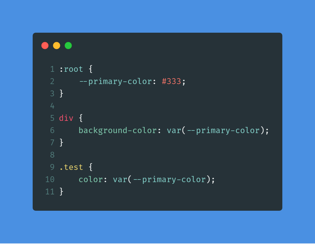
Custom - CSS Variable
After Before - Pseudo Selector
Content Placement: Content added with
::beforeand::afterpseudo-elements appears visually before or after an element's content box, without affecting the element's layout or positioning.Pseudo-elements: Utilize
::beforeand::afterselectors in CSS to insert content before or after an element's content.Illusion: CSS can create visual enhancements without altering the HTML structure, achieving effects like depth or motion.
Virtual Elements: CSS-generated elements, such as those created with
::beforeand::after, exist only in the styling context, not in the HTML markup.
h1{
    font-size: 6rem;
    font-family: Arial, Helvetica, sans-serif;
    /* background-color: plum; */
    width: fit-content;
    position: relative;
}

/* h1::before{
    content: "hiiiiii";
    background-color: magenta;
} */

h1::after{
    content: "";
    width: 1%;
    height: 0.3rem;
    background-image: linear-gradient(45deg, lightcoral, lawngreen, skyblue);

    position: absolute;
    left: 0;
    bottom: 0;
    transition: all 0.4s ease-in-out;
}

h1:hover::after{
    width: 100%;
}
Typical Device Breakpoints
| Device Type | Media Query Range | Example Resolution |
| Mobile Devices | max-width: 767px | Small smartphones |
| Tablets | 768px - 1023px | Larger smartphones and tablets |
| Small Desktops and Laptops | 1024px - 1279px | Standard laptops and smaller desktop screens |
| Medium Desktops | 1280px - 1439px | Larger desktop screens |
| Large Desktops and High-Resolution Displays | min-width: 1440px | Larger desktops and high-resolution displays |
Responsive Typography
/* Base font size for default screens */
html {
  font-size: 16px;
}

/* Media queries for different screen sizes */
@media screen and (max-width: 768px) {
  html {
    font-size: 14px; /* Adjust base font size for smaller screens */
  }
}

@media screen and (min-width: 1200px) {
  html {
    font-size: 18px; /* Adjust base font size for larger screens */
  }
}
Responsive Typography Within Parent Div
  .child {
    font-size: 2em; /* Set a base font size for child elements */
  }

  /* Media query for smaller screens */
  @media screen and (max-width: 768px) {
    .child {
      font-size: 1.5em; /* Adjust font size for smaller screens */
    }
  }
Tools for Reference
On the mobile device, open a web browser and enter the IP address of the computer running the web server,
followed by the port number if necessary. For example, if the IP address is 192.168. 1.100 and the web server is listening on port 8000, you would enter “http://192.168.1.100:8000” in the browser's address bar.
Eg. http://192.168.1.46:5500/
@media screen and (max-width: 767px) {
    .container {
            padding: 10px;
            /* Adjust spacing for smaller screens */
        }
}
References - Sample Projects
https://nova-speaker.webflow.io/ - 2024-01-17
https://wearecocoon.co.uk/ - 2024-01-18
https://silencio.es/ - 2024-01-19css


